Extreme close-up of a heavy debossed business card on uncoated linen paper, casting a soft shadow under natural side-light.
/ Common & Co

Systems built for physical weight.

We design enduring brand systems and tactile print collateral for cultural institutions and independent founders who value the sensory impact of paper, ink, and typographic restraint.

Flat-lay of open architectural books, custom paper swatches, and a steel ruler on a warm cream wooden studio table, soft window light.
The Studio

Rooted in Swiss modernism.

Founded on the principles of structural grid alignment and material integrity, our studio bridges physical craft and digital precision. We reject fleeting trends to focus on visual systems that hold their ground for decades.

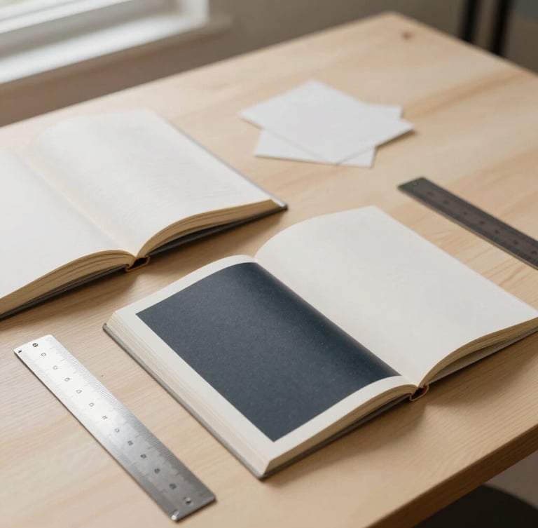
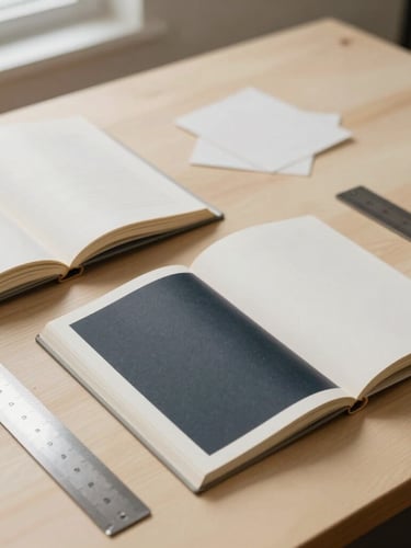
Working from our London workshop, we collaborate with curators and premium hospitality brands globally, selecting specific paper weights and custom inks before drawing a single typographic character.

Our Method

Restraint as a discipline.

We select the paper stock first. Ink behaves differently on uncoated linen, and understanding the physical substrate dictates our typographic scale, grid structure, and final layout decisions from day one.

By limiting our visual vocabulary to stark black ink and architectural layouts, we allow the tactile weight of the physical collateral to speak. True luxury whispers through material selection, not loud decoration.

Begin a project.

We partner with select founders and curators each season. Reach out to discuss your physical identity or print commission.